The HSL Panel in Lightroom is probably the least used and most misunderstood panel in the Develop module. However if you know the power of this panel you can really achieve some specific edits.
Change Selective Colour
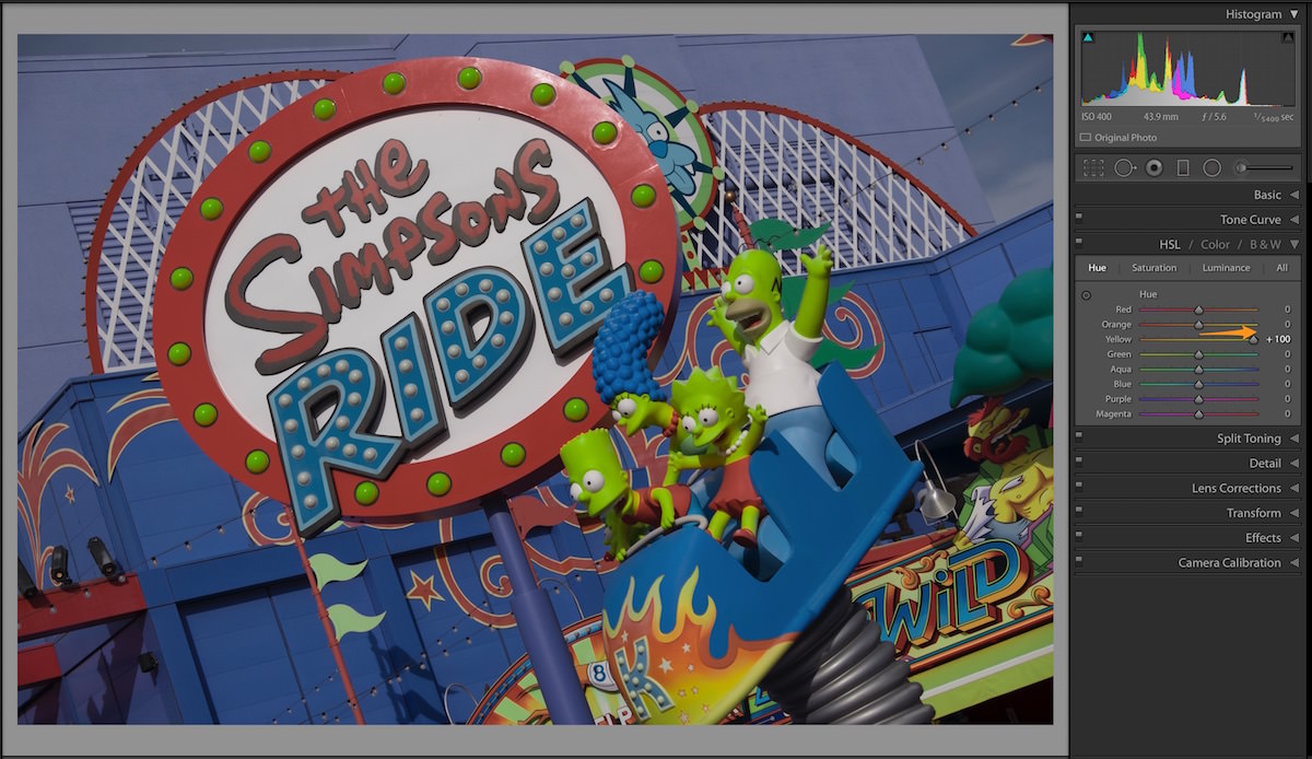
You can change one selective colour using the Hue sub-panel adjustments within the HSL Panel no need to use any selections or masks to make the changes. Each of the sliders show which colour you are moving towards when you move it left or right. I admit there are limitations with this but still a super quick way to change colours.
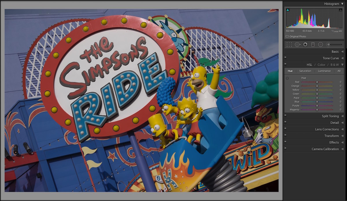
See the example below where we can easily turn The Simpsons family Green.
Just by shifting the Yellow slider towards the right, we change all the Yellow colour in the image towards Green. You can see the characters are now Green in the AFTER image as well as some globes on the sign behind them.
Saturate Selective Colour
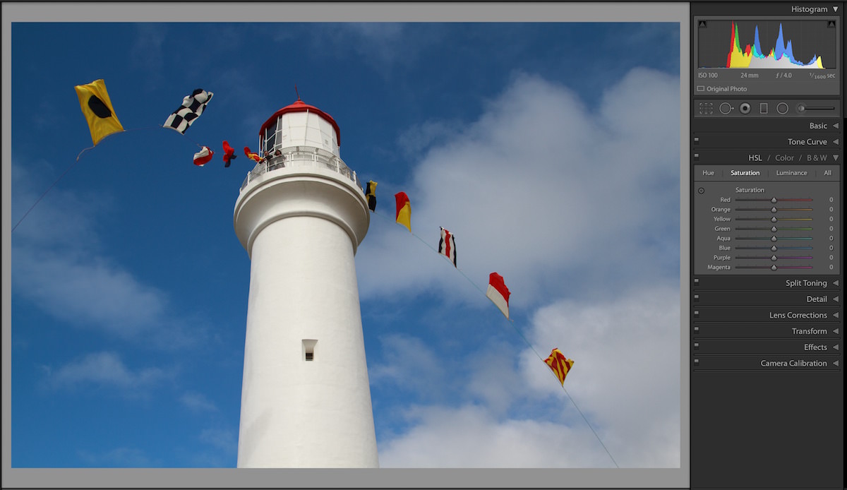
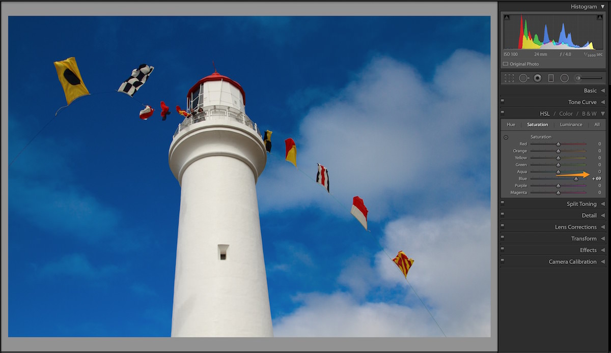
Another usage of this panel is that you selectively saturate a single colour without affecting the whole image. Like you want the sunset scene to have a bit more Purple in the image or bright blue sky to be more bluer. Just switch over the Saturation sub-panel to adjust the desired colour.
NOTE
As you can see in the AFTER image above, we have just added blue by adjusting the Blue slider to saturate the colour in the sky. You can use the global Saturation in the Basic Panel but then you are affecting all the other colours in the image as well.
Brighten or Darken Selective Colour
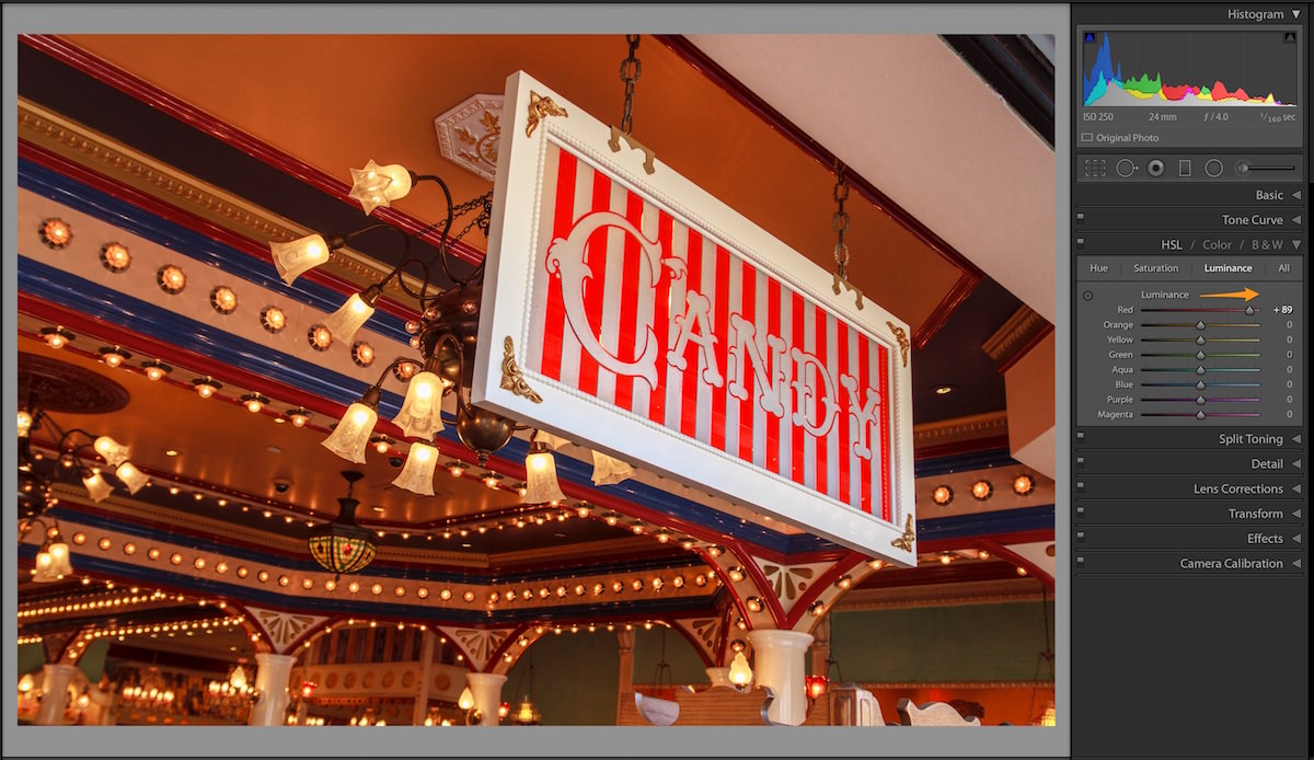
Now the last one is Luminance sub-panel. Luminance or Luminosity in photography terms stands for the brightness of a selective colour or image. So with this panel and the colour sliders we have, we can selectively brighten or darken a single colour. You should take care when using this as you will start to see strange results if you hit 90+ value in either side of the slider.
But what advantage this gives you is to adjust the brightness or exposure of a certain colour can be fine tuned. For example, if you consider the BEFORE image below, we have over all good exposure but the Candy sign blends into the background. I want to put more emphasis on this sign by brightening it up. The main colour in the sign is predominantly Red, so if I adjust the Red slider and move it towards the right to increase the brightness I can get the desired result. See the AFTER result.
There are other ways of doing this within Lightroom but sometimes the simplest and easiest adjustments are the best ones.
NOTE
Just a tip when you are working with these sliders, as you darken the colours it also tends to increase the saturation of that colour making it more prominent. Hence you might need to compliment these adjustments, with some adjustments in the Saturation sub-panel.
I hope this has expanded your understanding of this panel and you will now see opportunities to venture into this panel and utilise the finer adjustments that it has to offer.
Thanks for stopping by..leave a comment or share this post if you know somebody who’d find it useful.





Trackbacks/Pingbacks