Capture One Pro/Express can be quite intimidating at first, especially if you are coming from using Adobe Lightroom. In this post (and video below) I hope to bridge this gap.
You will hopefully find after reading this post and watching the video, that Capture One is actually more powerful, flexible and feature rich than Adobe Lightroom. And runs a lot faster (for me anyway), I know this topic has its many arguments.
You have two options, watch the video or read the post below and jump to that section of the video directly
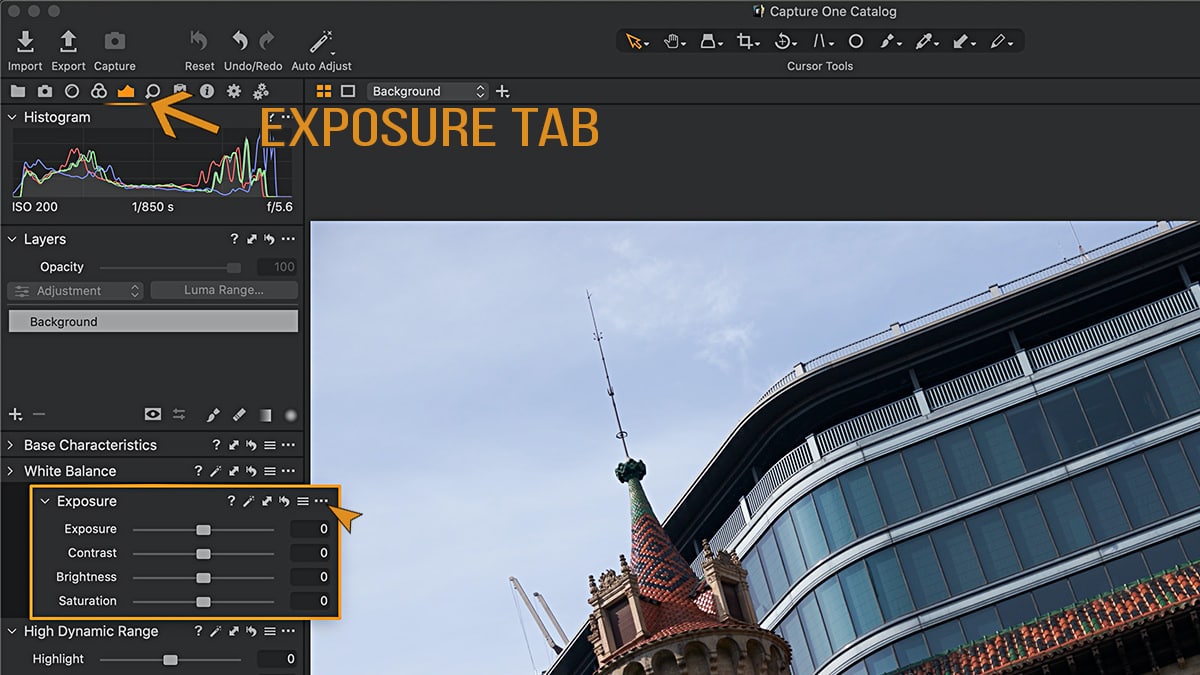
Tip #1 – Exposure Tab
Kind of like the Develop Module in Lightroom, the Exposure Tab in Capture One has many tools built it. However unlike Lightroom, you can customise, re-arrange and add other tools to this Exposure Tab (or any other tab). Because of this unique feature, you can really tailor the interface to your liking.
There are many tools that I add and customise to my Exposure Tab.
Check this out in full detail in the video, jump to 1:15.
Tip #2 – Image Browser
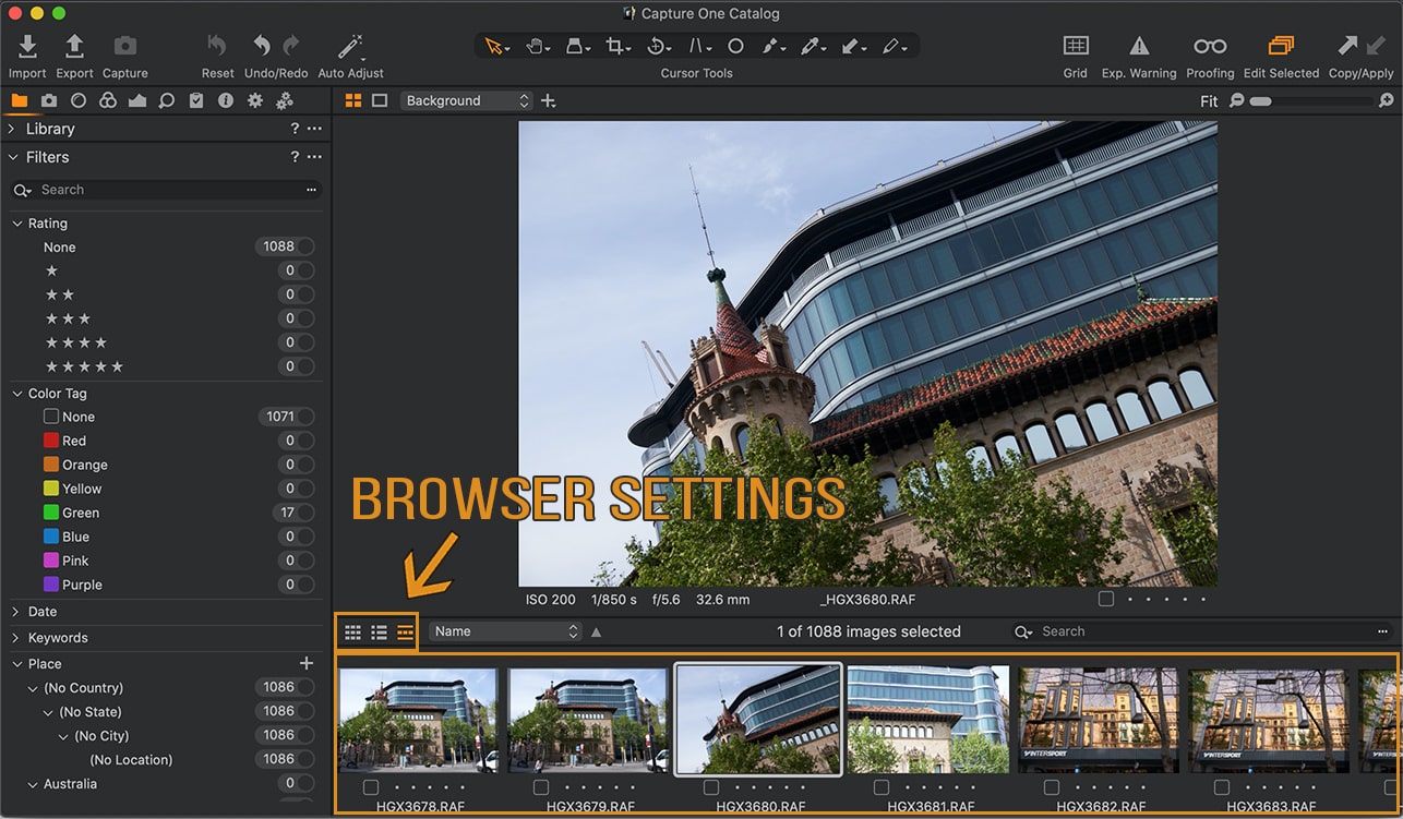
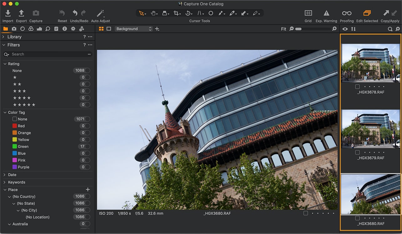
The Image Browser of Capture One can be compared to the Grid/Filmstrip in Lightroom. However Image Browser has many great options to again customise your interface so you get the best out of you image editing experience. You can arrange it to the right of the image or arrange it at the bottom. Each has its pros and cons. Eventually boils down to your preference.
The one thing missing in the Image Browser is that the default Sort is done by Name instead of Date/Time. Which is a pain as my images may be shot on multiple camera with their own naming/numbering sequence. Therefore when it comes to reviewing these images in Capture One, the default sort sucks big time. I wish the developers would change the ability or allow us to define a Default Preference for Sorting.
Check this out in full detail in the video, jump to 2:50.
Tip #3 – User Collections
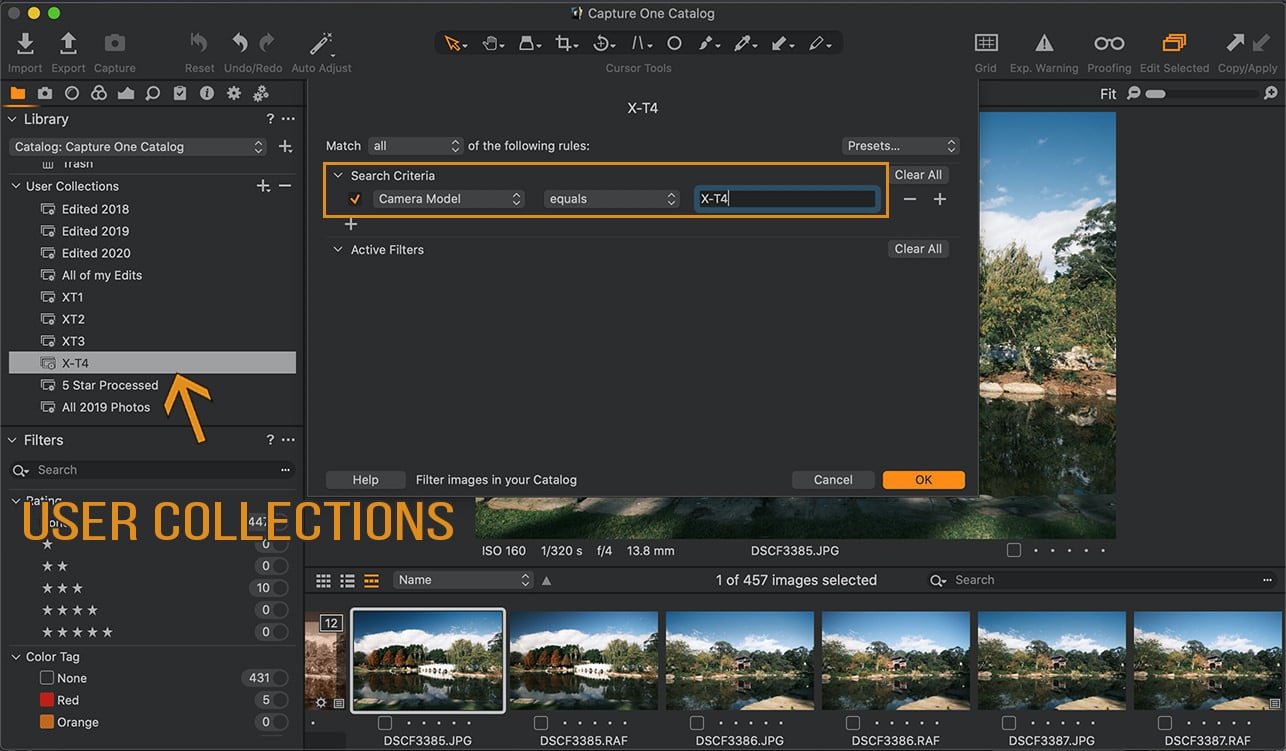
Capture One’s User Collections are similar to Lightroom, you can create Albums where you can drag and drop images or you can create Smart Albums where you can filter by a selection criteria.
I won’t bore you on this topic but you’d better just review the video. Jump to 4:40 in the video.
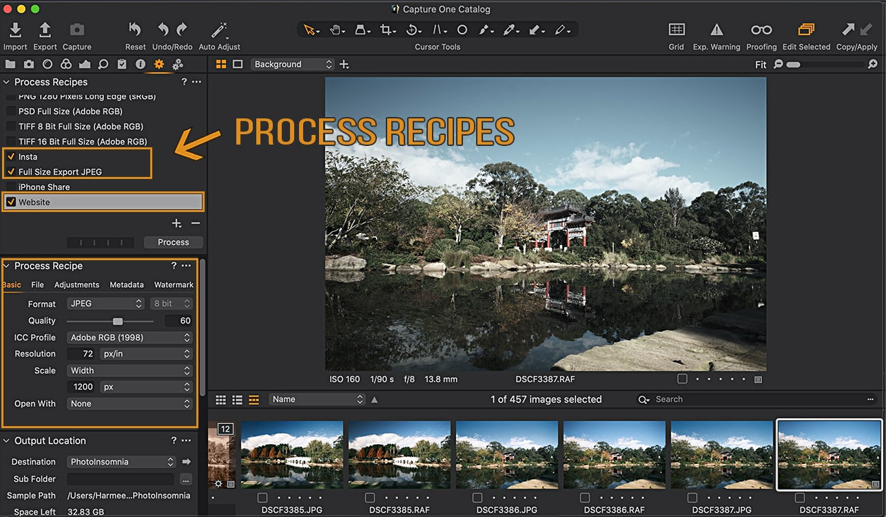
Tip #4 – Process Recipes
Process Recipes are like Export Presets but heaps better in Capture One. You can setup these recipes for export in Capture One with multiple sizes and destination folders etc. And then to top it off, you can choose multiple Process Recipes and run them on a single or bunch of images in one go!!
Not only that unlike Lightroom, Capture One processes these images much faster in my opinion. Check out how I use these Process Recipes in the video, simple jump to 8:00.
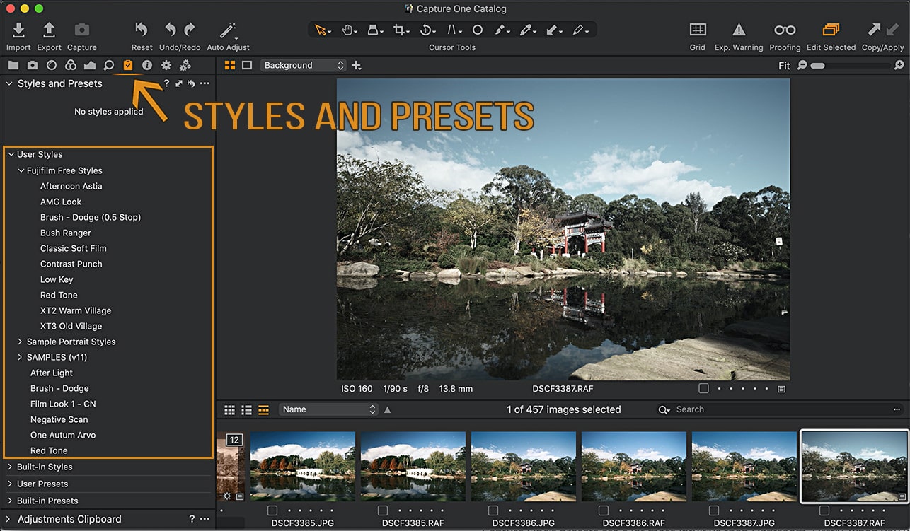
Tip #5 – Styles and Presets
Capture One’s presets are a lot more intuitive than Lightroom. Firstly, when you want to create a preset Capture One already prompts with the selection of tools that you have selected and applied on an image. This is not the case in LR (at least not until I was using it religiously), it simply show the selection of tools you chose last time and you have to remember which tools you used. I found myself starting to create a preset in Lightroom and then cancel out to check which tools I had selected many time over.
I just love this intuitive feature of Capture One, start creating a preset and it already selects all the tools you used. The other feature where it kicks Lightroom’s butt is that you can apply multiple presets by layering them on top of each other.
Check out how I use these presets jump to 10:08 in the video.
Conclusion
In concluding, it is true that Capture One interface is difficult to understand as a newbie. You feel like you need a course or degree to get your head around it. But I hope with these tips and more to come on this blog, I am making it easier for you to transition from Lightroom to Capture One.
If you are considering using or trialing Capture One, support me by using my affiliate link to download Capture One. It won’t cost you any more but it will help me run this site and create more content.
Don’t forget to share and comment on this post, if it helped you!


